Role: UI Design, UX Design, Front-End
March 2020: 3 months
The Client
Jason Hart, stage name Zerp, is a DJ and music producer. Mr. Hart has 20+ years of musical education and experience. His music style ranges from rock, pop, electric, and indie.

The Challenge
“Jason ‘Zerp’ Hart would like a website to advertise himself as a music producer and gain clients as such. As an already established DJ and music hobbyist, Zerp has a vast set of musical skills to offer and a creditable portfolio. Zerp hopes to show off this portfolio to kickstart his career as a producer.”
Zerp has a website for his DJ business, but not for his occupation as a producer. My team and I were challenged to create a new website to promote his talent and business as a producer. As an established musician, displaying and showcasing his work to attract potential clients was a top priority. Other requests Zerp had for us were, a detailed request/contact form, an “About” page, and to use of his brand.
Our Goal
For Zerp to gain clients and engage users, displaying his music portfolio was a high priority. The website should contain samples of Zerp’s music the user can listen to, an “About” page detailing his accomplishments/personality/history, and a contact form for client requests. Zerp has an established brand, incorporating his color scheme and punk aesthetic will set him apart from other online artists.
Research and Planning
With over 20 years of musical experience and education, Zerp has extensive musical knowledge and talent to produce quality music for clients. Whether people want soft background music or ferocious rhythms of electric dancing, Zerp can attract and cater to a wide range of audiences across a variety of ages and preferences. Zerp has attracted the attention of people as young as 20 to those who are well into their 60s. A common trait his audience carries is an appreciation for music. This audience represented a target audience for my team’s research purposes.

To understand Zerp’s audience and guide the website’s design, we surveyed 15 people who fit the audience description. We asked:
- Why would you choose to commission a music producer? What credentials or skills would they require?
- What is the first thing you look for when you visit a musician’s website?
- What makes a musician’s website memorable?
My partner and I then synthesized the data into common themes and expectations potential clients may have.
This data was also used to help form the website’s information architecture. My partner and I thought it would be best to evaluate information architecture with a top-down/bottom-up approach and an affinity diagram. Broad categories the site may entail were approached with the top-down methodology. Specific pieces of content users may look for were evaluated with the bottom-up approach. The allocation of such content was then decided with the use of an affinity diagram.
Top-Down Approach:
The top-down approach allowed my team to look at the broader categories and topics Zerp’s site could entail. “Listen,” for example, was given a category to house audio-related content. These topics also served as the basis for top-level navigation.
- Home – Home – Visitors to the site will be met with this page. This is where calls to action and invitations to listen to Zerp’s music shall be made. While not home to specific content, it will appear in the top-level navigation.
- Listen – The most important part of Zerp’s website. This is where links to his music will be hosted as well as embedded tracks. It is crucial that this page is well organized and displays content that will not detract from the music listening experience.
- About – This is where information about Zerp will be displayed. This is also where he can have his social media displayed.
- Contact – The main goal of the website is to have people hire Zerp for the creation of a music track. This is where visitors will be converted into potential clients. Here, things like Zerp’s contact info and a contact form will be located.
Bottom-Up Approach:
Whereas the top-down approach was evaluated from a broader perspective, the bottom-down approach took a look at specific content users may look for. To help guide this, our synthesized answers from our previous survey were turned into questions.
- Do you have an email?
- Do you have an Instagram?
- How much do you charge per track?
- What kind of genres can you produce for?
- Do you have any music videos?
- What instruments do you use?
- Can you be hired for events?
- Do you have samples of your past commissions?
- Do you have an education in music?
- Do you have samples of your own music?
- Do you specialize in any specific genre?
- Who are you?
- Where can I listen to your music?
- Do you have a contact form?
- Are you in a band or are you a solo artist?
- When are you available?
Affinity Diagram:
With both a top-down and bottom-up approach, my team organized specific content pieces into broader categories. Specific topics from the bottom-up approach were organized into similar categories. “Where can I listen to your music?” and “Do you have samples of your own music?” can be placed in the “Listen” top-down topic for example.

This diagram then helped dictate the website’s information architecture and maps the content of the website.

Wireframing and Prototyping
Based on the conclusions from our research and information architecture, my partner and I were ready to wireframe. We started with paper wireframes to establish a layout. User pain points and information architecture were taken into consideration during this process.
Users who visit the site are greeted with a hero image of Zerp and his social media links, reflecting questions about who Zerp is. Upon scrolling down, the user can find a music player with Zerp’s latest work, a small “About” section beckoning the user to further get familiar with Zerp, and a quick contact button to bring users to his contact form. Other pages followed a similar layout. The “Listen” page starts with a smaller hero/header image, followed by social links, and then music players for current and past releases.
When the draft was completed, my partner and I created a digital wireframe to be evaluated by Zerp.
Once approved, my partner and I created high-fidelity prototypes. Our main objective with the prototypes was to start incorporating Zerp’s punk branding and colors. We created three different samples and discussed which design would be used with Zerp.


Of the three designs, Zerp liked the colors and dark theme of design 2, and some of the content from design 3. He also suggested small design changes to the about section on the Home and About page. With this in mind, we changed our design and moved on to implementation.
Implementation and Deployment
In a previous meeting, Zerp and the team discussed how we would host and build the site. Zerp had an idea in mind; he chose to use WordPress as a content managing system and for it to be hosted on Ionos. Ionos was selected because of its price point to host simple websites. My partner and I were familiar with WordPress and had no issue with his decision.
To implement our design, my partner and I relied on HTML, CSS, and Elementor (website builder). The team was familiar with WordPress and front-end coding and ran into few roadblocks during production.


Conclusion and Results
Zerp Music was a commitment that exceeded the expectations of the client. Zerp was pleased to have a place to kick off his business as a producer. Once the website was transferred over, Zerp continued to evolve and add new content to his site. Today, Zerp has expanded his music reach and community through podcasting and blogging.
What I Would Do Differently:
Zerp Music was one of the first UX/UI Design projects I took on as a freelance developer; there were many accomplishments, but there are quite a few things I would do differently if I were to attempt this project again.
Currently, Zerp’s about section is a brief paragraph telling the user who Zerp is. Adding an endorsement, award, and education section to the about page would give users a brief overview of Zerp’s qualifications. The contact page could use a brief explanation/FAQ on how commissions work. Doing so could clear up common questions users may have and questions Zerp may find himself continuously answering.
The major thing I would have changed for this project is performing more user research. While I believe my partner and I did a great job capturing what a music producer’s site entails, it would be beneficial for the site to be tested and receive feedback from potential users. We only performed one survey, and that was used to structure the site’s information architecture. A full usability study post-implementation would have been beneficial to solidify some design choices, eliminate any potential design bias, and test how an iteration of a product stacks up against users.
Takeaways:
While working on Zerp Music, there were a couple of ideas that stood out to me, the effectiveness of usability studies and working with people who are developing design methods and styles concurrent to mine.
Another idea that stood out to me was working with another person with a different set of design methods and design styles. No matter how our discussions started, it would always boil down to wanting what we personally thought should be added to the design. For example, my partner and I found ourselves hung up on what we should add to the digital wireframe.
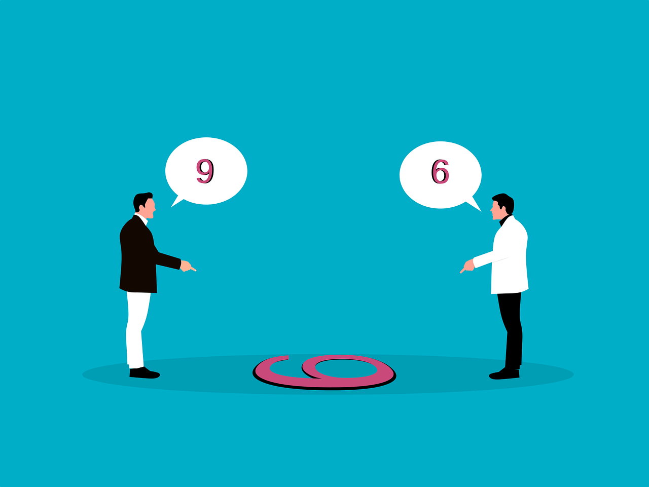
Another idea that stood out to me was working with another person with a different set of design methods and design styles. No matter how our discussions started, it would always boil down to wanting what we personally thought should be added to the design. For example, my partner and I found ourselves hung up on what we should add to the digital wireframe.
My partner wanted Zerp’s social links in the footer because they believed users may end up clicking off the site to view their social links. I wanted them under the hero image because I believed it would drive the most traffic to them as the top portion of the page is seen by most users. Both of us had reasons for where we wanted to place the social links. To resolve this difference and for the sake of continuing with the project, we settled on having them in both the header and footer.
This realization has made me more aware of how someone may rationalize their design choices and raised awareness of potential future roadblocks in communication.
As mentioned previously, my team only performed one user survey. While it helped guide the layout of the website, a usability study would have further benefited the project. Knowing how a potential user, divorced from the deeper development of the project, interacts with the site gives a handful of different advantages:
- Testing whether a user can complete the task without having any problems
- Discovering how long it would take a user to complete a task
- Identifying user satisfaction
- Testing performance based on set project goals
- Testing design layout and where it can improve
A usability study would have provided the team with more robust research to guide design proposals and changes. My partner and I bickered our biases more than we researched what has worked for other sites and what may work for the client. Performing a usability study would eliminate our biases and instead turn our focus to more concrete design choices.